Properties Grid
The Properties grid displays the Design properties for a selected project item, control, or component. Note that the grid only shows the properties that are statically set at design time. You can access addition properties from the Object Inspector in Object Explorer.
This topic describes the following:
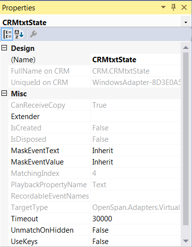
Here is an example of the Properties grid for a web adapter:
Properties grid drop-down combo box
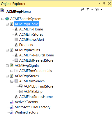
The drop-down combo box at the top of the Properties grid lets you select from any of the other controls that are of the same level or lower than the control selected in Object Explorer. For example, for the web adapter (Google application) shown in Object Explorer below:
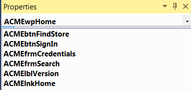
The drop-down combo box on the Properties grid shows the corresponding child controls:
There are three buttons at the top of the Properties grid window:
The Categorized button organizes the properties into common categories.
The Alphabetical button organizes the properties alphabetically.
The Properties Page button applies when a Studio project is selected in Solution Explorer. Click this button to open the Properties Pages for the project in the Designer.
The bottom of the window lists the currently selected property. It includes a short developer note about the property. Links to perform specific functions appear at the bottom of the grid. The links that appear depend on the control you selected.
