Using the ToastNotification component
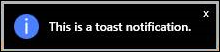
Beginning with build 19.1.38, you can add a ToastNotification component to the toolbox so that you can display toast-style notifications. A toast notification is a nonmodal window element that you can use to display brief messages that automatically expire. The following example shows an informational toast notification:
Adding a toast notification
- From the toolbox, add a ToastNotification component to your solution.
- In Object Explorer, select your ToastNotification component and drag the Show method to the automation surface.
- Enter the message.
- Choose a severity icon to indicate whether this is an Info, Warning, or Error type of message. The following example shows a ToastNotification component:

- Optional. To customize the notification, use the following properties:
Name -- Enter an internal name for the notification.
Alignment -- Specify where the notification is displayed on the screen.
Background color -- Choose the background color for the notification.
Display time -- Specify the amount of time, in milliseconds, that the notification should remain visible.
Exit style -- Select whether the notification should fade away or immediately disappear.
Text color -- Choose the color of the text.
